A few packaging design tips that will speak to your audience.
Creating just the right type of eye-catching packaging for your product will not only help you sell products. It can also improve your company’s brand identity. If you can pull off the perfect design, consumers will flock to your products and you’ll see them fly off the shelf (whether physical or online).
Product packaging design is often an art form all its own, which is obvious when you consider the various design principles involved. Today, we’re going to provide you with several packaging design tips. We’ll take a look at several recognized principles that your audience will respond to.
Balance
One of the most straightforward packaging design tips to remember is that every part of a design carries a visual weight to it. This includes images, shapes, patterns, colors, typography, and more. As each of these design elements are integrated into a package’s design, you must create a healthy balance and alignment. In other words, don’t put too much in one spot and not enough in another or there won’t be any visual interest.
Emphasis
Every package design includes many elements, but there are particular elements you want to emphasize. Many companies will put a heavy emphasis on images that relate to the product. Others will focus on the typography used for the product’s name or even your company or logo. You can create proper emphasis by figuring out the most important piece of information to provide on the packaging.
Contrast
Whenever you feel that a design “pops,” this is actually referring to the visual contrast. This is what creates space and difference between the various elements included in a package’s design. This is especially important typography because placing the most important words in bold or printing them larger will cause them to stand out. Contrasting colors in a package’s images is another important factor that a professional uses to grab a consumer’s attention.
Proportions
Proportions within a design are the easiest principle to understand, which means it’s also one of the easiest to get right. This design principle refers to the size of each element’s images and typography – in relation to each other. It is a technique used to focus on the most critical elements so that consumers can pick up on them. Larger elements will garner more attention and help your product stand out in a crowd.
Hierarchy
Hierarchy involves some of the design principles listed above as a technique used to show the level of importance of each visual element. It may sound obvious, but we’re going to say it anyway – the most important design elements of your package should appear as the most important. An easy way to figure this out is to put your most crucial elements at the top of the package, if applicable, and work your way down.
White Space
Also known as negative space, this design principle is unique because it’s the only one that concerns what not to add to the design. Many companies don’t realize how critical white space truly is. White space functions as a way to create hierarchy and organization by separating images, text, colors, etc. White space can also help create a minimalist aesthetic while allowing the individual design elements to “breathe.”
Movement
Movement refers to how a consumer’s eye moves over a package’s various design elements. As you might have guessed, this typically involves balance, contrast, emphasis, proportion, and other elements that we’ve already discussed. Think of this as creating a story, which will be followed by the consumer as they examine the packaging.
Repetition
If you’re looking for a way to reinforce an idea through your packaging design, then you should consider repetition. This basically means you’ll repeat certain elements throughout the design, whether it’s the same colors, shapes, typefaces, etc. Even the way you use white space between these repeated images can produce a visual rhythm that will be attractive to consumers.
Unity
Although some packaging design tips that we’ve listed here can be somewhat easy to tackle, unity can be a little trickier. This basically refers to how well your package’s visual elements work together to produce a coherent design which allows the package’s concept to be seen in a clear, cohesive way. Since this can become an art form all its own, it’s a good idea to call on the help of a professional to get it done properly.
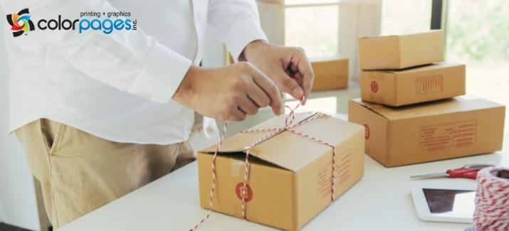
Contact Color Pages for Packaging Design Tips
Color Pages has designed custom product
packaging for
pharmaceuticals,
food,
beverages,
cosmetics, toys, and countless other items. If you need any more packaging design tips or have questions about our
graphic design or
printing services, call us today at
(727) 530-3370 to schedule a free consultation.